
Medscape v2
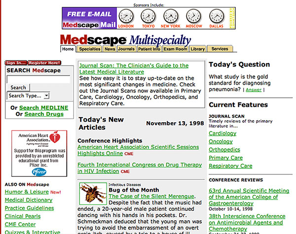
Medscape was growing very quickly in the early days. The information being collected needed to be presented in an organized fashion. In this iteration of the website design, "Specialty" home pages were created and a row of folder tabs were added to the top of the page to make options that were previously listed in the left-hand navigation more visible. This also freed up the left-hand navigation for new options.
# project management, UI/UX, production, template creation
Medscape v3
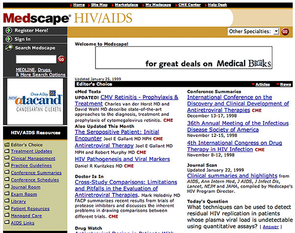
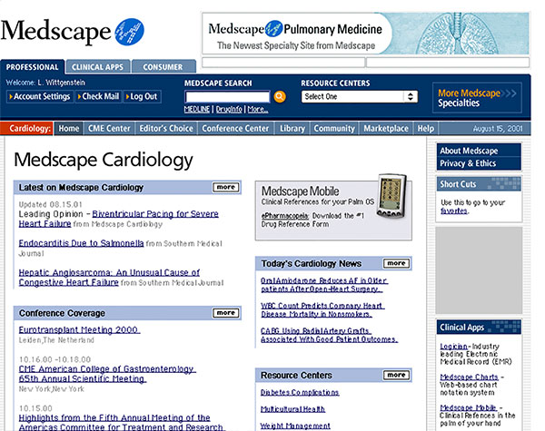
This represents the third major iteration of the Medscape website...the second during my tenior. This redesign formalized the changes made in the previous redesign. I suggested adding color to reinforce the idea the each discipline had become essentially its own website.
# Creative Director, project management, UI/UX, focus group testing
CBS Healthwatch v2
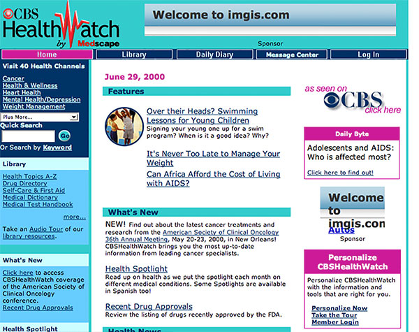
CBS Healthwatch was designed by a firm in Israel. Their use of bright blue and magenta may have seemed consumer-friendly at first, but in practice, we got lots of complaints at launch. This was the iteration after launch in an attempt to tame the palette and begin to address some navigation and advertising issues.
# designer, project management, UI/UX
CBS Healthwatch v3
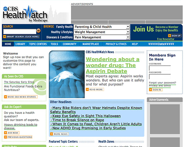
As part of a massive redesign of the site, the overall site design was done off-site, but the proliferation of templates required most of the practical work be adapted from the "master" design in-house. As project leader, I was partially responsible for finding the outside design house, and 100% responsible for overseeing all of the in-house projects...getting spec consensus from all groups involved in the project.
# Creative Director, project management, UI/UX, focus group testing
Medscape v4
The lessons learned from the CBS Healthwatch redesign came to bare on the Medscape redesign which overlapped by about 6 months. Medscape's redesign was more challenging because the site was being transformed from a 10,000+ hard-coded website to a CMS-driven platform. In addition, links to the consumer site needed to be incorporated.
# Creative Director, project management, UI/UX, focus group testing.
AVAYA
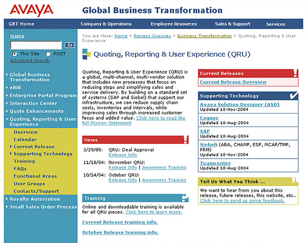
As a consultant, my job at AVAYA was to communicate organizational and procedural changes the company was undergoing via their existing intranet. To enhance those communications, I adapted subtle design elements into the existing CMS templates.
# designer, project management, UI/UX
Sickles Photo-Reporting Service
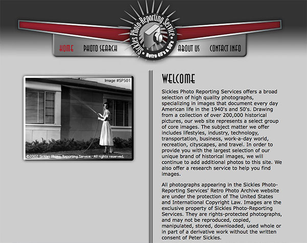
Development of this website required the cataloging of hundreds of photos and making those photos searchable. The client preferred to handle ordering ove the phone, so an e-commerce solution wasn't necessary.
# Creative Director, project management, UI/UX
Kinley & Manbeck
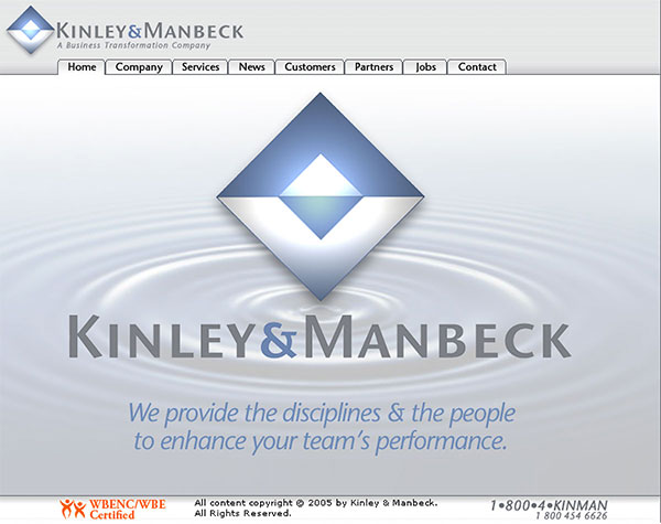
As a consultant for K&M, I was tasked with redesigning their website. Although I did not stay with the company long enough to see the completion of the project, this was the most favored design at the time.
# project management, UI/UX
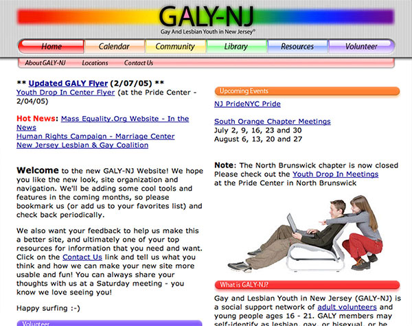
GALY-NJ
Pro-bono work involved the creation of a logo and a website with an eye towards expansion into interactive features.
# Creative Director, project management, UI/UX
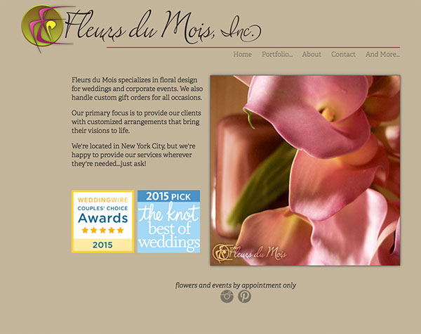
Fleurs du Mois
Fleurs du Mois is a rapidly growing company. This is the second redesign of the site in as many years.
# Creative Director, project management, UI/UX
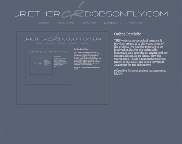
Online Portfolio
THIS website serves a dual purpose. It provides an outlet to showcase some of the projects I've had the pleasure to be involved in. But for the technically inclined, it also provides an example of my coding abilities. So go ahead, view the source code. This is a responsive site that uses HTML5, CSS3, and just a tiny bit of Javascript for the slideshows.
# Creative Director, project management, UI/UX
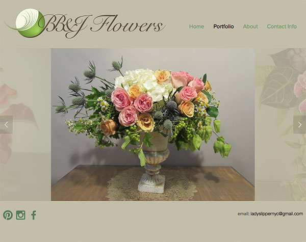
BB&J Flowers
My work on Fleurs du Mois lead to work with BB&J Flowers. In this case, it was decided to use a web service, SquareSpace, an adapt one of their templates to suit my client. Virtually every aspect of the original template has been altered to meet the client's vision.
# designer, project management, UI/UX

BioInsights
One of my earliest projects, BioInsights was looking for a website with growth potential. I chose a folder tab metaphor and the underlying code easily accommodates more tabs without making structural changes to the site.
# Creative Director, project management, UI/UX